Role
Head of Design
Stages · Product & brand · 2021–2024
Stages let a creator launch a white-label streaming service of their own — their brand, their prices, their audience. I ran design for it: six designers, building for a market none of us lived in. What follows is the decisions, and what each one cost.
Role
Head of Design
Team
6 designers
Design systems
2, from scratch
Scale
50,000+ registrations
A creator with an audience has two options and both are bad. Stay on a platform and it takes a cut, ranks you, and decides what you may publish. Leave, and you rebuild payments, hosting, a player, a paywall and a site before you sell anything.
Stages was the third option.
Two sides, one product. Viewers got a storefront — showcase, player, live streams, chat. Creators got the panel behind it: playlists, prices, payment partners, going live.
The decision underneath was where settings live. The ordinary answer is an admin area behind the public page, and it is the cheaper one to extend. We put every control on the page the audience sees instead, because a creator who has to imagine the result before publishing mostly does not publish. The cost was real: every new feature now had to be designed twice, once as a thing and once as a thing being edited.
Payments included Pix. Brazil was a core market, Pix is how Brazilians actually pay, and neither of those facts was visible from where we sat.
Building the showcase — layout, video, lessons, and the card edited on top of the page the audience sees.
A course in Portuguese, then live — and who is allowed to watch it.
Getting paid: Pix, CPF, a bank account — and the option to sell without the platform commission.
Apps, desktop, mobile web — full functionality on all of them. The alternative was the usual one: a full desktop tool and a reduced mobile companion, which costs a fraction to build and is what most platforms in this category ship.
We rejected it because the creators we were building for run their business from a phone, not from a desk. So the rule went into the design systems: a component missing on one platform was a bug, not a scope decision. It made every feature slower to finish, and it is the reason a creator could go live, price a video and connect a payment partner without opening a laptop.
The same course, the same tools — phone and desktop.
One system for the creator’s CMS, one for the viewer app — atomic, built from scratch, over 1,000 components between them. A single shared system would have been less work and is what I would normally argue for.
It was the wrong answer here. The two sides had different densities, different tones and different jobs; one system would have made the viewer app inherit an admin tool’s habits. So they share primitives and never borrow each other’s patterns.
Each component got its own page, written down. That documentation is what let six designers ship without me reviewing every screen — the point of writing it was never tidiness, it was removing myself from the critical path.
The documentation site: every atom listed, each with its own page.
Instead of arguing internally about what creators wanted, we put clickable prototypes and targeted landing pages in front of bought traffic and watched who signed up.
It is slower than deciding in a room and it costs media budget. It also meant several directions never got built, and the ones that did arrived with the argument already settled — which is the part that pays for itself when a team of six is waiting on a decision.
Features advertised before they were built. What people signed up for decided what got made — and what didn’t.
30+ landing pages, 300+ ad creatives, and the corporate material around them — merch, presentations, social covers, business cards, exhibition stands. Most of it for Brazil, where Portuguese runs long and never fits an ad format designed for English.
So the acquisition material was built the way the product was: as a system with parts. A new market or a new angle became an assembly job, not a redesign.
The brand itself came from Lander & Fitch. I extended the book with the rules partners actually needed.
Six creatives, one skeleton — the variable is the argument, not the layout.
Positioning, mechanics, a seasonal promo — the same parts, reordered.
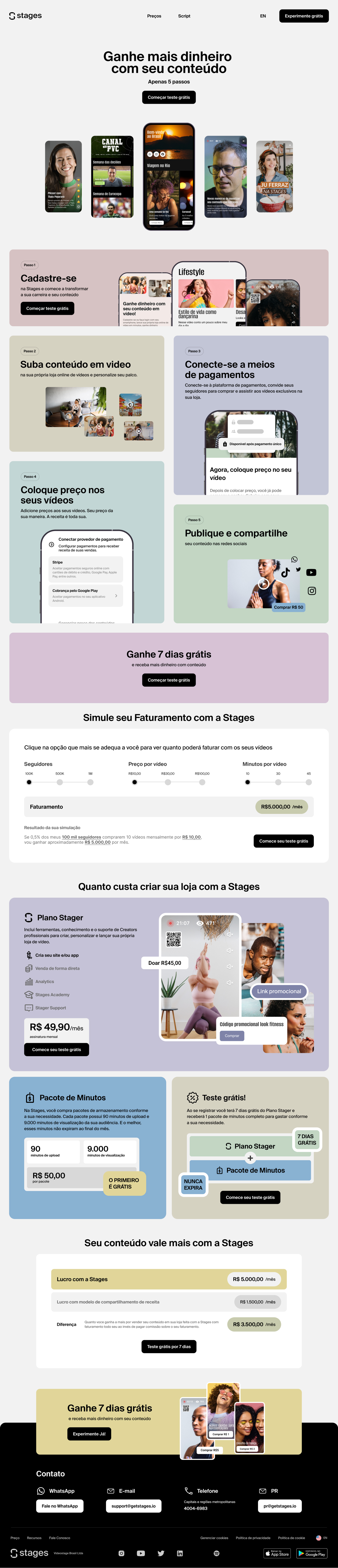

The same page, desktop and mobile, scrolled together — promise, mechanics, pricing, one repeated call to action.

The tote shipped blank, with iron-on sticker packs — you decorate it yourself. The same promise as the product: we give you the surface, you bring what goes on it.